Welcome back to Checkmate Chronicles, the devlog series where we unveil the behind-the-scenes of Chessarama’s development process! Today, we’ll dive into the creative process behind the redesign of the board in our Chess Match game mode.
Starting point: a simple and functional board
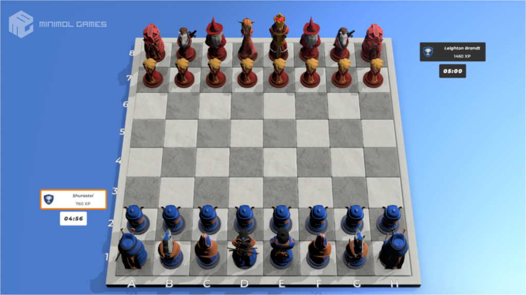
Every great journey begins with a single step, and ours started with a simple and functional board created on a provisional basis.
However, it didn’t capture the essence of Chessarama. It was necessary to elevate its standard and grant it the deserved brilliance.
Transformation step by step
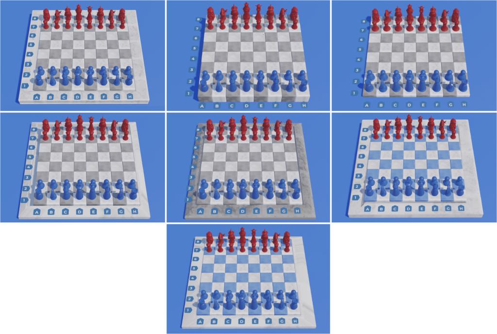
We kicked off the transformation by creating seven different variations for the new board. Each of them explored distinct possibilities, varying in the colors of the board, the tiles, the materials, as well as details in the finish, unleashing the first wave of changes.
After this exploration, we decided to iterate on more subtle and less realistic textures, seeking a more stylized approach.
One of the most valuable insights from this initial exploration was the decision to position the coordinates directly on the board, providing a more integrated interface and avoiding reading issues due to contrast changes.
We still had doubts about the blue colors on the tiles, an issue we knew would only be resolved with direct testing in the game engine.
Rethinking the chess board design
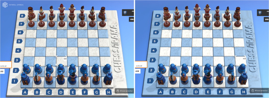
Moving forward, we experimented with a more rounded format for the board, a significant change that set us on the path to the final version.
We liked the new shapes, and the next iteration brought the board back to a lighter background, with refined edges and a sculpting work to add volume and contrast.

After this test, we decided that we would iterate on the shapes of the board and on the small volumetric details in the coordinates, which added a refined touch to the design.
The final adjustments
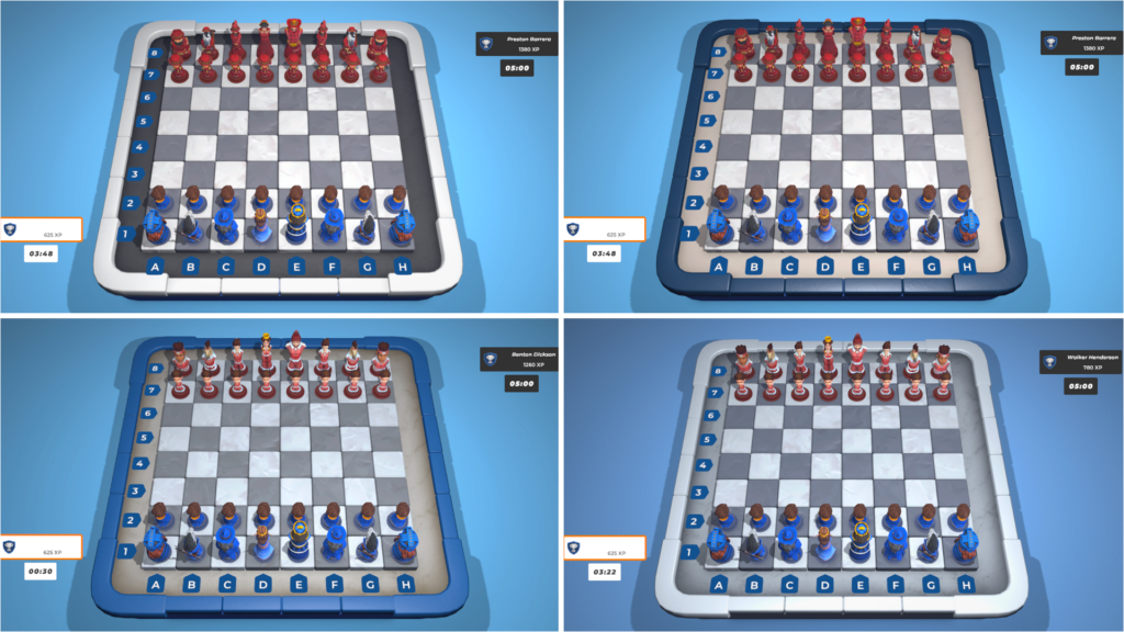
We explored more neutral options for the board, seeking a balance that contrasted with the cheerful and colorful background, characteristic of Chessarama.
We chose to follow the direction of option 4, deepening our tests in textures and materials.
From vision to reality: the new board
After several iterations and meticulous adjustments, we reached the final version of the board. It was completely revamped, from the initial concept to the final modeling and texturing.
We adjusted the camera position and refined the lighting, all to ensure an impeccable and joyful visual experience, worthy of the Chessarama universe.
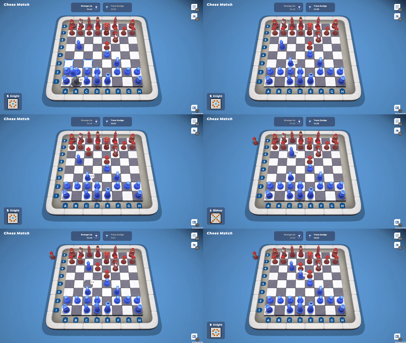
We hope you enjoyed following the journey of the Chess Match board’s transformation!
It was a work filled with dedication and meticulous attention to detail. And we can’t wait to share more behind-the-scenes stories with you in the upcoming posts. 💙
Don’t forget to add Chessarama to your Wishlist, and let us know in the comments: which part of Chessarama’s development would you like to know more about in the next chapter of Checkmate Chronicles?
Until the next chapter and game on! ♟️
